All links in the left-nav will have the same functionality - simply the formatting has changed.

-
2026+
- Release Notes: April 7
- Release Notes: April 3
- Release Notes: March 31
- Release Notes: March 24
- Release Notes: March 20
- Release Notes: March 10
- Release Notes: March 6
- Release Notes: March 3
- Release Notes: February 24
- Release Notes: February 19
- Release Notes: February 17
- Release Notes: February 10
- Release Notes: January 30
- Release Notes: January 27
- Release Notes: January 20
- Release Notes: January 13
- Release Notes: January 9
-
2025+
- Release Notes: December 19
- Release Notes: December 16
- Release Notes: December 9
- Release Notes: December 2
- Release Notes: November 21
- Release Notes: November 18
- Release Notes: November 11
- Release Notes: November 7
- Release Notes: November 4
- Release Notes: October 28
- Release Notes: October 21
- Release Notes: October 14
- Release Notes: October 10
- Release Notes: October 7
- Release Notes: September 30
- Release Notes: September 23
- Release Notes: September 16
- Release Notes: September 9
- Release Notes: August 29
- Release Notes: August 26
- Release Notes: August 19
- Release Notes: August 12
- Release Notes: August 8
- Release Notes: August 5
- Release Notes: July 22
- Release Notes: July 18
- Release Notes: July 15
- Release Notes: July 8
- Release Notes: July 1
- Release Notes: June 27
- Release Notes: June 24
- Release Notes: June 10
- Release Notes: June 6
- Release Notes: June 2
- Release Notes: May 27
- Release Notes: May 23
- Release Notes: May 20
- Release Notes: May 9
- Release Notes: May 6
- Release Notes: April 22
- Release Notes: April 15
- Release Notes: April 8
- Release Notes: March 25
- Release Notes: March 21
- Release Notes: March 18
- Release Notes: March 11
- Release Notes: March 7
- Release Notes: March 4
- Release Notes: February 25
- Release Notes: February 20
- Release Notes: February 18
- Release Notes: February 11
- Release Notes: February 6
- Release Notes: February 4
- Release Notes: January 28
- Release Notes: January 21
- Release Notes: January 17
- Release Notes: January 7
-
2024+
- Release Notes: December 17
- Release Notes: December 10
- Release Notes: December 3
- Release Notes: November 25
- Release Notes: November 20
- Release Notes: November 19
- Release Notes: November 13
- Release Notes: November 12
- Release Notes: November 5
- Release Notes: October 30
- Release Notes: October 29
- Release Notes: October 22
- Release Notes: October 16
- Release Notes: October 15
- Release Notes: October 8
- Release Notes: October 2
- Release Notes: October 1
- Release Notes: September 24
- Release Notes: September 20
- Release Notes: September 17
- Release Notes: September 10
- Release Notes: September 3
- Release Notes: August 27
- Release Notes: August 23
- Release Notes: August 20
- Release Notes: August 13
- Release Notes: August 9
- Release Notes: July 26
- Release Notes: July 12
- Release Notes: June 28
- Release Notes: May 17
- Release Notes: April 26
- Release Notes: April 12
- Release Notes: March 15
- Release Notes: February 23
- Release Notes: February 2
- Release Notes: January 19
-
2023+
- Release Notes: December 22
- Release Notes: November 24
- Release Notes: October 13
- Release Notes: September 29
- Release Notes: September 8
- Release Notes: August 4
- Release Notes: July 14
- Release Notes: June 6
- Release Notes: May 26
- Release Notes: May 5
- Release Notes: April 14
- Release Notes: March 31
- Release Notes: March 17
- Release Notes: March 3
- Release Notes: February 17
- Release Notes: January 20
- 2022+
-
2021+
- Release Notes: November 2 - December 9, 2021
- Release Notes: October 4 - November 1, 2021
- Release Notes: August 7 - October 3, 2021
- Release Notes: June 13 – August 6, 2021
- Release Notes: May 16 – June 12, 2021
- Release Notes: May 2 – 15, 2021
- Release Notes: April 18 – May 1, 2021
- Release Notes: March 21 – April 17, 2021
- Release Notes: March 7 – 20, 2021
- Release Notes: February 7 – March 6, 2021
- Release Notes: January 24 – February 6, 2021
- Release Notes: January 10 – January 23, 2021
- Release Notes: December 6, 2020 – January 9, 2021
-
2020+
- Release Notes: November 22 - December 5, 2020
- Release Notes: November 8 - November 21, 2020
- Release Notes: October 25 - November 7, 2020
- Release Notes: October 11, 2020 – October 24, 2020
- Release Notes: September 27 – October 10, 2020
- Release Notes: September 13, 2020 – September 26, 2020
- Release Notes: August 30, 2020 – September 12, 2020
- Release Notes: August 16, 2020 – August 29, 2020
- Release Notes: August 2, 2020 – August 15, 2020
- Release Notes: July 5, 2020 – August 1, 2020
- Release Notes: June 21, 2020 – July 4, 2020
- Release Notes: June 7, 2020 – June 20, 2020
- Release Notes: May 24, 2020– June 6, 2020
- Release Notes: May 10, 2020 – May 23, 2020
- Release Notes: April 26, 2020 – May 9, 2020
- Release Notes: April 12, 2020 – April 25, 2020
- Release Notes: March 28, 2020 – April 11, 2020
- Release Notes: March 16, 2020 – March 27, 2020
- Release Notes: March 1, 2020 – March 15, 2020
- Release Notes: COVID-19 Related Release Notes
- Release Notes: January 1, 2020 – February 29, 2020
- 2019+
- 2018+
- 2017+
- 2016+
- 2015-
- 2014+
- 2013+
- 2012+
Release Notes: v15.20
- Navigation
- Campaign Center
- Messaging
- Mobile
- Reports
- Responsive Guest Website
- Known Issues
- Other Acknowledgements
Navigation
User Experience
Merchant portal navigation and overall user experience has been updated in this release. The new layout is following a more consistent and modern design with a simplified top panel and condensed left navigation pane. The top panel displays the merchant name on the left and three options on the right with the ability to logout, view help pages, or select a favorite home page. The merchant logo has been removed from the top left corner and replaced by a Paytronix logo to represent the “home” button on a consistent basis. Users can navigate back to their favorite home page by clicking this home button at any time.
Left-Navigation Pane
Each section on the left-nav now has a dedicated icon next to the label and sections are initially displayed in their compressed format with the detailed list of options hidden from the user. As the user hovers over or clicks on a section header, the detailed list of options will become visible for selection. In order to quickly navigate to a particular page, users can also use the Quick Find functionality located at the top of the left-nav.

Collapsible Functionality
The new left-navigation pane is designed to improve usability on tablets and mobile devices. Users have the option to collapse the entire left-nav in order to increase space available for the main page content. In order to collapse or expand the left-nav, click the Collapse option at the bottom of the pane.
Campaign Center
New Data
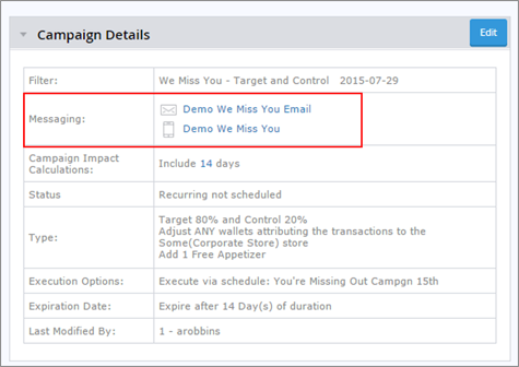
When viewing the campaign details for a specific campaign, the Messaging row will display an envelope icon if there is an email associated with the campaign, and a mobile icon if there is a mobile message associated. Users will now find the template name printed to the right of the icon. Both the text as well as the icon are clickable and will pop open a model to display the email or mobile template design.
Similar to the Spend/Eligible Guest metric that previously existed, the Visit/Eligible Guest metric has been added to the Detailed Campaign Information section. Visit/Eligible Guest represents the total number of visits performed by the eligible guests divided by the number of eligible guests targeted in the campaign. Both metrics can be helpful in normalizing the data to compare across campaign occurrences or to compare target and control groups.

Target and Control
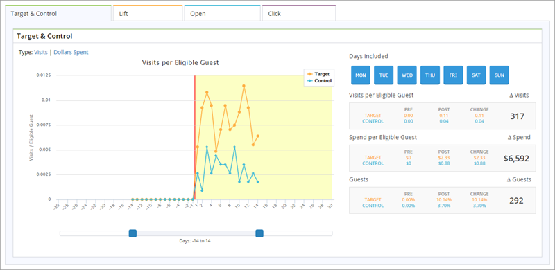
Lift Analysis is now available for Target and Control Campaigns via the new “Target and Control” tab found in the Campaign Center Dashboards. The control group may be a smaller sample size than the target group, so this new analysis will take into account the difference in size when calculating lift. Users will continue to see 60 days-worth of data, plotting visit and spend behavior for 30 days prior to campaign execution as well as 30 days post campaign. However, with Target and Control campaigns, both the visit and spend graphs will use a different y-axis to normalize the data and account for the difference in sample size. For visits, the “visits/eligible guest” will be used and with spend the “spend/eligible guest” is plotted. The target group’s behavior and the control group’s behavior will be plotted on the same graph together.
After the axis is changed to accommodate for the difference in sample size, lift is calculated by (1) taking the difference between the pre-campaign behavior and the post-campaign behavior for both the target and control groups, and (2) subtracting the control difference from the target difference. This lift analysis produces a statistically significant result – the delta behavior (visits, spend, or guests) that was generated by the campaign.
Messaging
Wallet Expiration Substitution Parameter
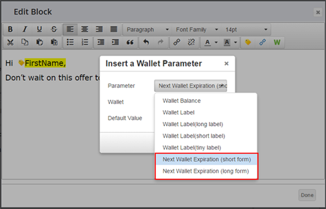
Users can insert wallet expiration dates dynamically into the body of editable text regions using a simple drop down and select system, rather than adding code in the Advanced HTML tab. There is a short date format and a long date format available. Expirations will be based on the wallet selected by the user. If a guest’s wallet has a quantity greater than one with multiple expiration dates, the next upcoming expiration will be displayed only. For detailed information on this parameter, navigate to the Advanced HTML tab within the Email Tool and click on the Template Help button in the top right corner.
Anniversary Date Substitution Parameter
Users can now dynamically insert anniversary date into the HTML of an email by using the Anniversary Date substitution parameter. For detailed information on this parameter, navigate to the Advanced HTML tab within the Email Tool and click on the Template Help button in the top right corner.
The syntax required is the following: <template:insert field="anniversary_date" />
Configurable Store Settings
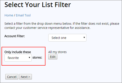
Corporate users can determine which store segmentation should be presented as the default for use within the Email Tool. When scheduling corporate or LSM emails via the Email Tool, users can segment by enrollment store or by favorite store. In the case that favorite store is used most often, the enrollment store option can be removed from the list and the default can be set to segment by favorite store instead. Please speak to a Technology Consultant to configure this option.
Mobile
Navigation Drawer
Our iOS and Android mobile applications now have a new navigation drawer in the top-left of the Home screen. When app users click this button, a menu will slide out, revealing account maintenance options like Edit Account, Privacy Policy, Add to Passbook (iOS only), and Location Settings.
Additionally, you can add custom links to the side drawer that offer extra value to your application. Buttons can open a website in an internal or external browser. Potential uses for these custom links include Twitter, Instagram, or Facebook pages, menus, or a promotional page. Your brand will have full control over the framed, mobile-responsive website, meaning that you can update elements on the pages at any time.
Refer-a-Friend
Refer-a-Friend functionality is now available on both our Android and iOS application. Your members will have a unique referral URL, with which they can spread the word on four exciting channels:
- SMS Text Message: Members can tap the SMS option to send the invite through their native message app.
- Email: Send an email invitation to one or multiple friends via the app, which accesses the member’s contacts directly.
- Facebook: Members can share their unique referral link through an integrated Facebook platform.
- Twitter: Members can Tweet their unique link and customize their post.
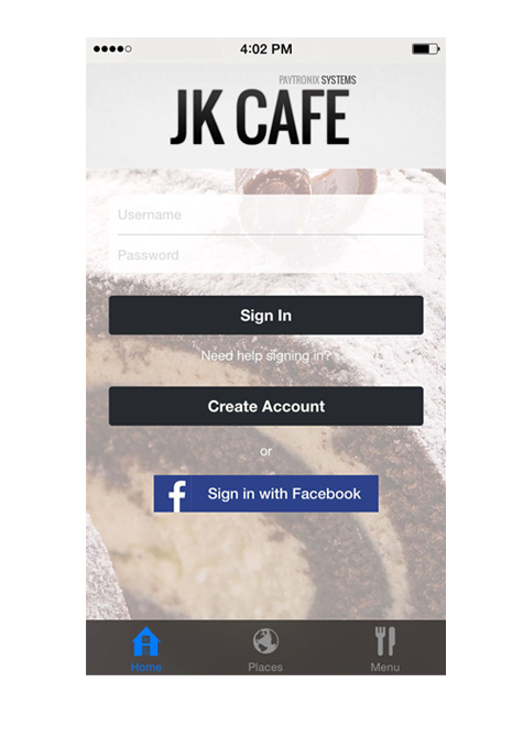
Register or Login via Facebook
Potential members can now reverse enroll into your program via Facebook. Also, if they have previously attached a Facebook account to your program via your website, they can use these Facebook credentials to sign into your mobile application. This method of enrollment or logging in is convenient and simple for your guests to use, saving them from the prospect of creating yet another username and password for your program.
Registration and login via Twitter is coming soon.
Reports
High Point Accrual Activity Report
As of V15.20, we have added the cardholder phone number and mobile phone number to the high point accrual activity report. You can find the two additional columns in the right-most portion of the report.
Responsive Guest Website
Introducing Responsive eGift
Our eGift website is now mobile responsive. Clients will need to work with their technology consultant to migrate branding onto the new responsive template. Legacy pages will not automatically become responsive without this.
Local Store Charity
You can allow your charitable members to detach from the current charitable organization and reattach to a new one of their choice. For example, if you’re running a charitable program that donates proceeds to local schools, your customers will have the ability to attach detach from School A and reattach to School B inside your customer portal. Any funds earned towards school A prior to the detachment will still be ultimately donated to School A. Funds earned after the switch to School B takes place will be given to School B.
Furthermore, CSRs can now view the charitable organization to which a member is linked in the Account Lookup area. Simply click the “Account Balance” link on the selected account. The organization to which the customer is attached will appear under the “Active Challenges” heading.
Known Issues
Merchant Website
In certain instances, the left navigation will appear without CSS changes applied. If this happens, please clear your internet browser cache.
Other Acknowledgements
1. Third-Party Library Software
- Apache Software Foundation: This product (Paytronix) includes software developed by the Apache Software Foundation (http://www.apache.org/), including: Apache Commons, Apache httpClient, Xerces, log4j, Jakarta Commons, Apache Jakarta-Oro, APR snprintf library, Apache FOP, and Apache Batik.
- Exolab Project: This product (Paytronix) includes software developed by the Exolab Project (http://www.exolab.org), including: Castor.
- Sun Microsystems, Inc.: This product (Paytronix) includes software developed by Sun Microsystems, Inc. (http://www.sun.com), including: Java Cryptography Extension (JCE), Java Communications API, and Secure Sockets Extension (JSSE) – which also includes code licensed from RSA Data Security.
- SourceForge.net: This product (Paytronix) includes software developed by SourceForge.net and distributed under the Common Public License, including WTL and distributed through a ZLib License for tinyxml.
- Thai Open Source Software Center Ltd, Clark Cooper, and Expat maintainers: This product (Paytronix) includes software developed by Thai Open Source Software Center Ltd, Clark Cooper, and Expat maintainers including Expat XML Parser Library.
- Jean-loup Gailly and Mark Adler: This product (Paytronix) includes software developed by Jean-loup Gailly and Mark Adler including ZLib Compression Library.
- JCIFS smb client in Java. This product (Paytronix) uses software developed by Michael B Allen, distributed by GNU Lesser General Public License as published by the Free Software Foundation, including jCIFS SMB client in Java. Paytronix has made modifications to this software. Pursuant to the GNU LGPL, we are posting the changes to the code made on our website. Please see www.paytronix.com/download/jcifs/jcifs.tar.gz
- Mort Bay Consulting: This product (Paytronix) includes Jetty Web Server developed by Jan Bartel and Greg Wilkins and other contributors.
- Hypersonic SQL. This product (Paytronix) includes products developed by Hypersonic SQL. This software is provided by the copyright holders and contributors “as is” and any express or implied warranties, including, but not limited to, the implied warranties of merchantability and fitness for a particular purpose are disclaimed. In no event shall the Hypersonic SQL Group, or contributors be liable for an direct, indirect, incidental, special, exemplary, or consequential damages (including, but not limited to, procurement of substitute goods or services; loss of use, data, or profits; or business interruption) however caused and on any theory of liability, whether in contract, strict liability, or tort (including negligence or otherwise) arising in any way out of the use of this software, even if advised of the possibility of such damage. This software consists of voluntary contributions made by individuals on behalf of the Hypersonic SQL Group. Copyright © 1995 – 2000, The Hypersonic SQL Group. All rights reserved.
- The HSQL Development Group. This product (Paytronix) includes products developed by The HSQL Development Group. This software is provided by the copyright holders and contributors “as is” and any express or implied warranties, including, but not limited to, the implied warranties of merchantability and fitness for a particular purpose are disclaimed. In no event shall the HSQL Development Group, HSQLDB.org, or contributors be liable for an direct, indirect, incidental, special, exemplary, or consequential damages (including, but not limited to, procurement of substitute goods or services; loss of use, data, or profits; or business interruption) however caused and on any theory of liability, whether in contract, strict liability, or tort (including negligence or otherwise) arising in any way out of the use of this software, even if advised of the possibility of such damage.
- Eclipse SWT. This product (Paytronix) contains products developed by Eclipse SWT.
